What Does a Graph of Medical Data Really Say?
I love the Mark Twain quote, “Lies, damn lies, and statistics.” That’s because, in medicine, stats and how data is presented can be used in all sorts of ways. Today we’ll look at some data on the CDC website as an example.
My Favorite Data Hustle
Cholesterol-lowering drugs have very poor results in reducing heart attacks. However, if you look at the ads for these drugs or talk to the average physician prescribing them, you would believe the opposite. Why? That’s because of a data hustle called relative risk.
In most government-funded studies of how well cholesterol-lowering drugs work, the absolute risk reduction is about 1% over 5-years. That’s a really bad clinical result, as it means that 1% fewer people die of a heart attack due to taking these expensive and side-effect-laden drugs. For example, if I told you that an expensive new device for your car could reduce your risk of getting in a bad car wreck by 1% over 5 years, you would likely never buy the device. The risk reduction is just too minuscule.

Credit: Shutterstock
However, why do many physicians believe these drugs work better than they do? That’s called relative risk. The FDA allowed these drug companies to take the raw data from a study and perform some sneaky math. So if 3% of the study population not on statin drugs died from a heart attack over 5 years and 2% taking statins died over the same time period, the drug company takes that 1% drop and divides it by the 3% to get a 1/3 or 33% relative reduction in risk! Basically, it’s still putting lipstick on a pig, but heck, if you never look at the raw data, you would never know that you’ve been had.
How Recent CDC COVID Graphs Can Show How Careful We All Need to Be When Interpreting Scientific Data
I used to spend quite a bit of time on the CDC website in 2020 during the first wave of the pandemic. However, I haven’t looked at it much in the past 12-18 months as I’ve been too busy with other things. However, yesterday that changed.
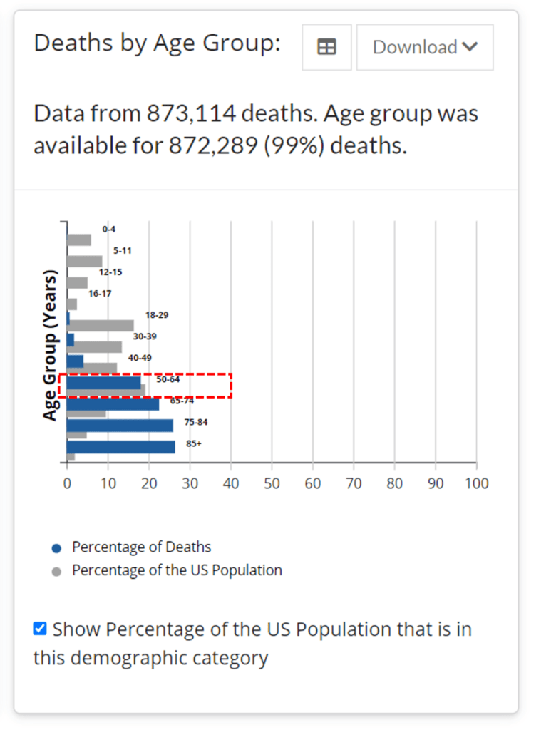
Given that cases were rising and we’re going through yet another COVID news cycle, I wanted to see what we’re dealing with. Hence I went right to the CDC website. While perusing the graphs on cases and deaths, I was interested in where I stood as a 58-year-old, so I pulled up this table:

Wow! Check out that 50-64 age group! That looks like almost as many deaths as the older age groups all the way up to age 85+. This graph made me very nervous as it seems to show a dramatic shift in the number of younger people dying. So I went to see my next patient and it wasn’t until I got back to my computer that I realized what was up.
On closer inspection, this re-swizzled CDC graph says exactly the same thing that all other graphs about COVID have always shown. Meaning it still shows that COVID is a disease most severely impacting the old. To see that, I needed to take this raw data and create my own graph from it.
The CDC graph above shows the percentage of deaths (blue bars) versus the percentage of the population (grey bars). First, note that my age group is stuck in the middle of a 15-year range when the age groups before and after it are in smaller 10-year increments. Also, note that the 50-64 age group represents a much larger slice of the US population (grey bars) than all of the older and younger age groups. That’s because that’s a good chunk of the “Baby Boomer” generation you’ve heard about for decades.
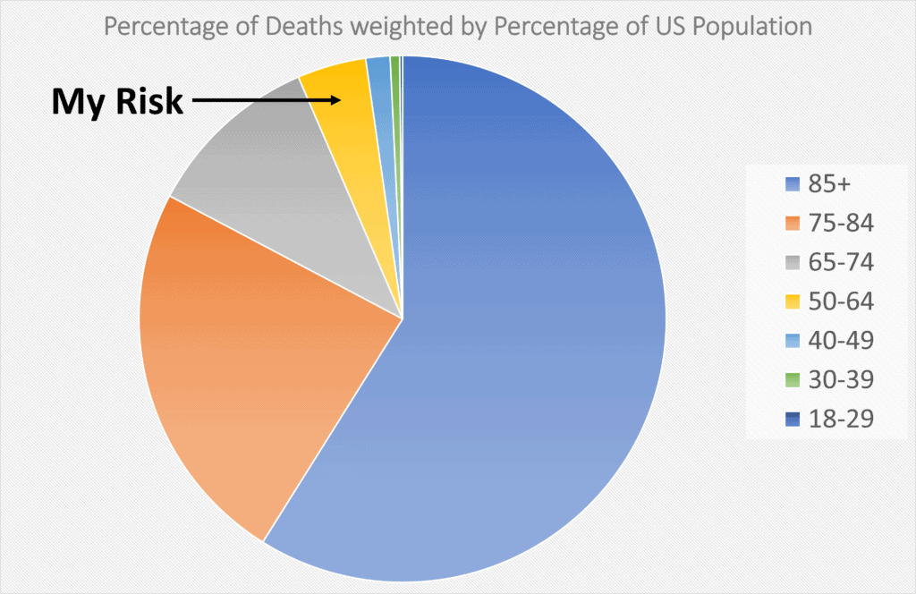
If I want to know my relative risk as compared to other age groups, some simple math is needed. Hence, by age group, we need to take the percentage of deaths and divide it by the percentage of the whole US population. That will give me a sense of how likely a 58-year-old is of dying compared to an 80-year-old.
Here’s the percentage of deaths adjusted for the percentage of the population:

Now we see the same graph we have seen many times during the pandemic, that death is much more common in the older age groups ascending by age. In the first graph, lots of 50-64 year olds are dying, but there are just many more of them due to the baby boom. However, as a percentage of their age group, 85+-year-olds are dying at a rate 15 times greater than 50-64 year olds. All the first graph did was show us the huge impact the peak of the baby boom generation has had on demographics.
The upshot? Why did the CDC choose to show a very different graph? Who knows, but I hope you can see that you always need to be cautious in reading medical studies and data. You need to know what’s being shown to you. You may even need to do some simple math and re-graph the data to get a sense of what it’s really telling you!

NOTE: This blog post provides general information to help the reader better understand regenerative medicine, musculoskeletal health, and related subjects. All content provided in this blog, website, or any linked materials, including text, graphics, images, patient profiles, outcomes, and information, are not intended and should not be considered or used as a substitute for medical advice, diagnosis, or treatment. Please always consult with a professional and certified healthcare provider to discuss if a treatment is right for you.
